
Websites With Feedback: How to Get Real Input on Your Site
If you want feedback on your website, you have two routes. You can put a feedback tool on the site, such as a widget, a short survey or a visual comment layer. Or you can ask people directly: colleagues, customers, review communities and forums. The first gives you a steady stream from real visitors. The second gives you quick opinions on a single draft. This guide covers both, shows which type of feedback answers which question, and ends with the step most teams skip: turning what people say into a test.
TL;DR
- A website feedback tool collects input straight from visitors, so you learn why they behave as they do, not only what they did.
- Match the method to the question: widgets for page-level comments, surveys for comparable answers, visual feedback for design and QA, recordings and heatmaps for behavior.
- Ask at the moment of friction, such as a pricing page or an exit action, and keep questions short.
- Give every response an owner. Feedback that lands in an unwatched inbox changes nothing.
- Treat each insight as a hypothesis and run an A/B test to confirm that your fix works.
Table of Contents
- What a website feedback tool actually does
- The main types of website feedback
- Live site or staging: where you collect matters
- Where to get feedback on your website, step by step
- How to ask so people actually answer
- What to check when choosing a feedback tool
- Perspective: feedback tells you what to test
- Turning feedback into improvements
- A worked example
- Try the testing step with Stellar
- Common mistakes to avoid
- FAQ
- Sources
What a website feedback tool actually does
Analytics tells you that 70% of visitors left your pricing page. It does not tell you why. A website feedback tool collects input directly from users so you can understand the reasons behind behavior and spot friction in the experience. That is the shift from "what happened" to "why it happened."
Without that input, teams tend to decide from contextless numbers. Feedback fills the gap by capturing an opinion at the exact moment something confuses or blocks a visitor. That is why it pairs so well with conversion work: the comment points to the problem, and the test proves the fix.
The people who need this most are not only UX researchers. Marketers running paid traffic to a landing page, ecommerce owners wondering why carts get abandoned, and product marketers launching a new page all need a quick read on how real people react.

The main types of website feedback
Not all feedback is the same. Teams can collect comments, bug reports, survey responses such as NPS, and behavioral signals like session recordings and heatmaps. Another practitioner guide splits this into direct input and indirect input. Direct input includes comments, feature requests, ratings and bug reports. Indirect input includes analytics events, heatmaps, recordings, search queries and funnel drop-off.
Here is how the common formats compare.
| Format | Best for | What you get | Watch out for |
|---|---|---|---|
| Feedback widget or button | Page-level comments from anyone | Open-text remarks tied to a page | Self-selected input, often from frustrated visitors |
| On-page survey (NPS, CSAT, short poll) | Comparable, structured answers | Scores you can trend over time | Long surveys cut response rates |
| Exit-intent form | Learning why people leave | Reasons at the moment of departure | Needs a light touch so it doesn't annoy |
| Visual comments on the page | Design review, pre-launch QA | Annotated screenshots with technical context | Meant for reviewers, not the general public |
| Heatmaps and session recordings | Spotting patterns without asking | Where people click, scroll and stall | Shows behavior, not motive |
| Support tickets and sales calls | Indirect, high-intent input | Real objections in customers' words | Scattered across tools |
One practitioner summary puts the division of labor well: widgets suit page-level context, surveys give structured research, behavior analytics reveals patterns, and replay or bug capture tools diagnose friction. You rarely need all of them. Pick the one that matches the question you have today.
Live site or staging: where you collect matters
Feedback comes from two very different places.
On the live site, you collect visitor sentiment and behavior. This is where marketers and growth teams spend their time. Feedback on live pages is used for visitor sentiment, and the questions are things like "Did you find what you needed?" or "What stopped you from signing up today?"
On a staging site or pre-launch build, you collect design sign-off, bug reports and QA notes from teammates and clients. Visual feedback tools are the standard approach here, since comments pin to the exact element in question.
Mixing the two causes trouble. A bug report from a colleague on a staging page tells you nothing about how a first-time visitor feels about your headline. Decide which job you are doing before you choose a tool.

Where to get feedback on your website, step by step
If you are asking "where can I get feedback on my website?", work through these in order, from cheapest to most thorough.
- Ask people you know, with a script. Send three or four colleagues or customers the page and one task: "Find the price and tell me what you'd do next." Ask them to talk out loud. Five people will surface the obvious problems.
- Post in a relevant community. Founder, design and marketing communities often review sites if you ask a specific question. "Is it clear what we sell within five seconds?" gets better answers than "What do you think?"
- Add a small on-page widget or survey. One or two questions on the pages that matter most: pricing, checkout, key landing pages.
- Add behavior tools. Heatmaps and recordings show where attention goes. Our guide to using heatmaps and behavior analytics walks through reading them.
- Run a usability test. Watching people attempt real tasks beats any opinion. See our practical web usability test guide for how to set one up.
- Test the fix. Once you know what to change, validate it with an experiment rather than a hunch.
How to ask so people actually answer
The quality of feedback depends on timing and question design more than on the tool.
Ask at the moment of friction. Targeting the right visitor at the right moment, such as on a pricing page or during an exit action, makes feedback more useful for diagnosing intent and conversion barriers. A survey on your homepage for everyone is noise. A one-question prompt for people who viewed pricing twice and left is signal.
Keep it short. One to three questions beat a ten-question form. People are in the middle of a task and have little patience.
Use exit-intent carefully. Exit-intent forms work because they let you ask why without interrupting a task in progress. Show it once, make it dismissible, and ask one open question.
Questions that tend to work:
- "What almost stopped you from signing up today?"
- "Was anything on this page unclear?"
- "What were you hoping to find here?"
- "What would make this page more useful?"
Avoid leading questions ("How much did you love our new design?"). They produce flattering, useless answers.
What to check when choosing a feedback tool
Categories matter more than brand names here, so judge any option against the same short list.
- Widget types. Popup, slide-up, button or embedded. Teams should also weigh targeting rules, anonymity, privacy compliance and ease of installation.
- Who gives the feedback and where it goes. Decide who is providing the input, what you need to learn, and where the feedback goes before comparing features.
- Technical context. For bug and design feedback, look for automatic capture of browser, OS and console logs, on-page annotation, and support for non-technical reviewers.
- Workflow integrations. Connection to project management tools means reports become tasks instead of sitting in an inbox.
- Pricing model. Feedback tools commonly charge per seat or a flat monthly fee. If you invite clients or stakeholders, check whether guest users count toward seat limits.
- Page speed. Every script you add loads for every visitor. Keep the stack lean, especially on landing pages where load time affects conversion.
Perspective: feedback tells you what to test
We build A/B testing software, so we see the same pattern in almost every team we talk to. Someone collects feedback, a long list builds up, and then nothing ships because nobody can agree which comment matters.
Our view is that feedback is the start of an experiment, not the end of a research project. A visitor says the pricing page is confusing. That is a hypothesis. Rewrite the plan names, change the order, or add a line under the price, then let real traffic vote.
That is what we designed Stellar for. Our no-code visual editor lets a marketer change a headline, button or layout without waiting on a developer. Our goal tracking and real-time analytics show whether the change moved the metric you care about. And because our script is only 5.4KB, we built it so that the testing layer itself stays out of the way of the experience you are trying to improve.
Feedback explains the why. Testing proves the what. Teams that run both stop arguing about opinions and start learning from visitors.
Juan
Turning feedback into improvements
Collecting feedback is the easy half. Using it is where most teams stall.
Give every response an owner
A common mistake is letting feedback disappear into an unmonitored inbox. Decide at setup who reads responses, how often, and who gets notified when something urgent comes in. A weekly 30-minute review beats a quarterly data dump.
Sort by page and by theme
By collecting opinions at the moment of friction, you can see which pages to fix first, which elements cause confusion, and whether your changes worked. Tag each comment with the page and a theme such as pricing clarity, trust, speed, navigation or form length. Then count. Three people mentioning the same confusing form field outweigh one long rant.
Combine sources
One source misleads. A full picture comes from pairing direct input like bug reports with survey answers, behavioral data such as heatmaps and recordings, and indirect input like support tickets and sales conversations. If a heatmap shows people ignoring your call to action and survey answers say the offer is unclear, you have a strong case for changing the copy.
Write a hypothesis, then test it
Use a simple template:
Because [feedback or observation], we believe changing [element] to [change] will improve [metric] for [audience].
Example: "Because six visitors said they couldn't tell what the Pro plan includes, we believe adding a one-line summary under each plan name will increase clicks on the plan buttons." Run it as an A/B test, with one change at a time, until you have enough traffic to trust the result. For the bigger picture on structuring this work, read our guide to marketing funnel optimization and our steps to improve conversions.
Landing pages are the best first target
Feedback has the highest payoff on pages where you pay for the traffic. If visitors say the headline doesn't match the ad, or the form asks for too much, those are fast, cheap fixes. Our posts on fixing copy and form friction on landing pages and designing landing pages that convert cover what to change. For a broader set of tactics on optimizing landing pages, pair visitor comments with a clear priority list.
A worked example
Imagine a small ecommerce store selling skincare. Traffic to the product page is healthy, but few people add to cart.
- Observe. A heatmap shows visitors scrolling past the product description and stopping at shipping details.
- Ask. A one-question prompt appears after 30 seconds: "What would you like to know before buying?" Answers cluster around shipping cost and return policy.
- Hypothesize. Because shipping and returns are the top questions, showing them above the add-to-cart button should lift add-to-cart rate.
- Test. Build the variant in a visual editor, split traffic, and track clicks on the add-to-cart button as the goal.
- Decide. If the variant wins, ship it. If not, you have learned the concern was something else, and the next round of feedback tells you what.
No developer is needed for steps 3 and 4 with a no-code editor, which is why small teams can run this loop weekly.
Try the testing step with Stellar
Once your feedback points to a page change, we make the testing part simple. Stellar is an A/B testing platform built for marketers and growth teams at small and mid-sized businesses. You get a no-code visual editor, advanced goal tracking, real-time analytics and a lightweight script. It connects directly with WordPress, Shopify, Webflow, Wix, Squarespace, Framer and Bubble.
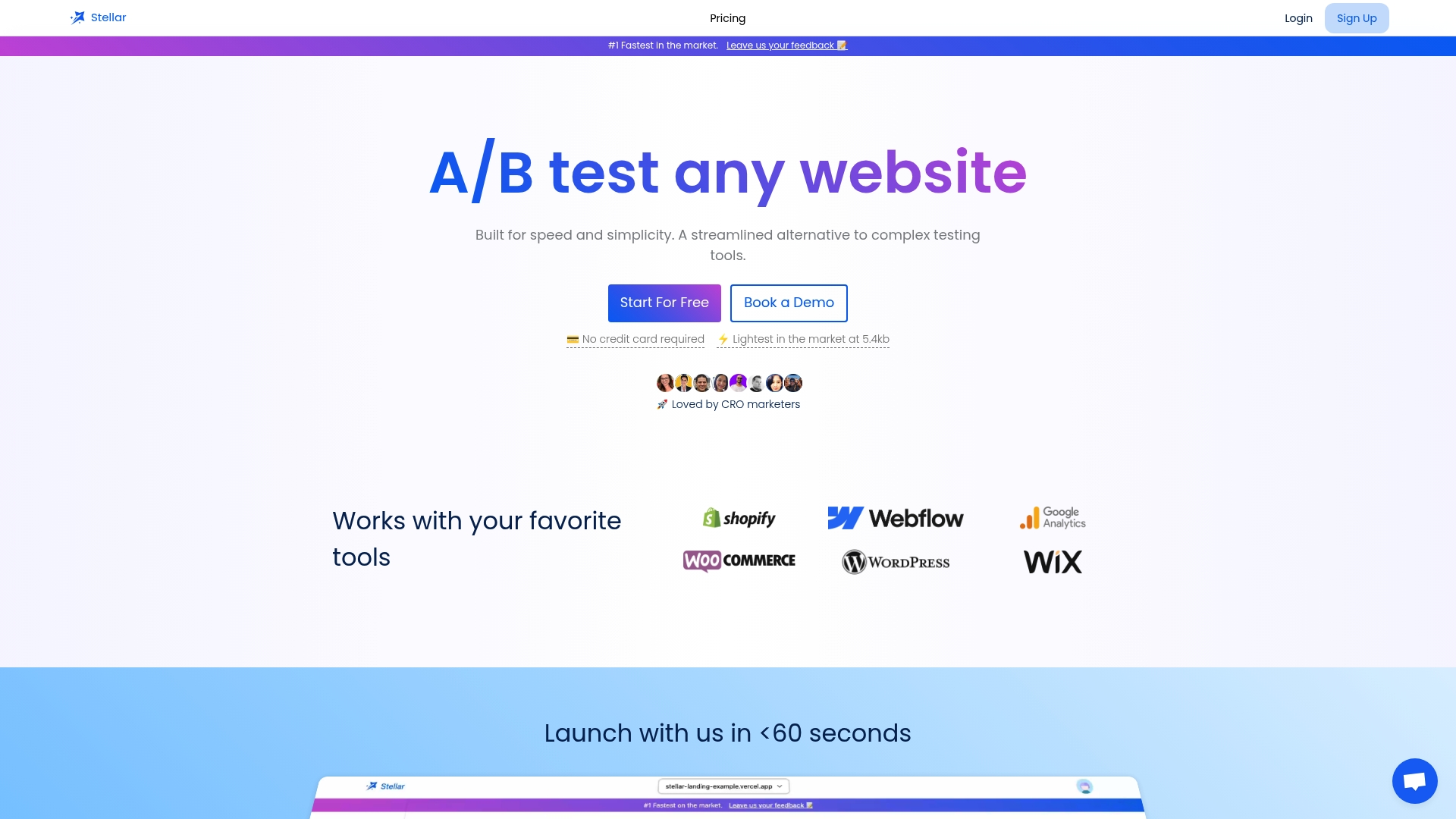
Pricing is based on monthly tracked users. The Sandbox plan is $0 per month, Plus is $29 per month, Pro is $99 per month and Scale is $399 per month. Enterprise is available with custom pricing. Our free plan is designed for businesses with fewer than 25,000 monthly tracked users. You can compare plans and start on the Stellar pricing page.
Common mistakes to avoid
- Asking everyone everything. Target by page, behavior or traffic source instead of showing the same survey sitewide.
- Treating loud feedback as representative. Widgets attract people with strong feelings. Check comments against behavior data.
- Changing five things at once. You will not know which change worked.
- Skipping the follow-up. If a visitor reports a problem and you fix it, a short "you were right" note builds goodwill and invites more input.
- Collecting without a decision in mind. Before adding any tool, write down the decision the feedback will inform.
FAQ
Where can I get feedback on my website?
Start with a few people who match your audience and give them a specific task. Then add an on-page widget or short survey on key pages, and post specific questions in relevant online communities. For hard numbers on whether a change helps, run an A/B test.
What is a website feedback tool?
It is software that collects input from visitors or reviewers directly on your site. It can take the form of widgets, surveys, exit-intent forms, visual comment layers or behavior tracking. The goal is to learn why people behave as they do and where the experience creates friction.
What is the best feedback widget?
The best one depends on the job. For visitor sentiment, choose one with page targeting, short surveys and privacy controls. For design review or QA, choose one with annotations and automatic technical details. Check install effort, integrations and how seats are priced before you commit.
How do I know if a change based on feedback worked?
Define one goal metric before you make the change, such as sign-ups or add-to-cart clicks. Then split traffic between the original and the new version and compare. Feedback tells you what to try, and the test tells you whether it worked.
Sources
- Website feedback use case overview
- Website feedback: how to collect it the right way
- How to use a website feedback tool
- Website feedback tools compared
- Website feedback software and targeting
- Choosing a website feedback tool
- Turning feedback into tasks
- Guide to collecting user feedback on websites