
Website UX Audit: How to Run One That Lifts Conversions
A website UX audit is a structured review of how real visitors move through your site, where they get stuck, and what to fix first. The most reliable way to run one is to start with analytics to find where people drop off, use a heuristic review to explain why, test with real users to confirm it, then rank fixes by impact and effort. Then you prove each fix with an experiment.
This guide walks through that sequence for marketers and growth teams, with the data to pull, the methods to use, a report structure and realistic cost ranges.
TL;DR
- A UX audit combines analytics, heuristic evaluation, usability testing and observation to produce user-centered recommendations, according to HubSpot's guide.
- Scope it to one audience and one journey (for example, a first-time visitor comparing plans), not "the whole site".
- Use data to find where the problem is, expert review and user testing to learn why, and an A/B test to prove the fix works.
- Score every finding on impact and effort separately, then start with high-impact, low-effort fixes.
- Agency audits can start in the tens of thousands of dollars. A do-it-yourself audit costs time and the tools you already have.
Table of Contents
- What a website UX audit actually covers
- When to run an audit
- Step 1: Scope the audit before you open any tool
- Step 2: Gather the data
- Step 3: Run a heuristic evaluation
- Step 4: Add usability testing and behavior tools
- Step 5: Rate and prioritize findings
- Step 6: Report so that something gets fixed
- Step 7: Turn findings into tests
- Perspective: why we pair every audit with experiments
- What a UX audit costs
- Turn findings into live experiments with Stellar
- FAQ
- Sources
What a website UX audit actually covers
A UX audit is a systematic way to assess a product for gaps, challenges and opportunities in the user experience. HubSpot describes it as a mix of empirical analytics, heuristic evaluation, usability testing and observation, all feeding recommendations built around the user.
That is broad, so it helps to know what it can surface. Dovetail's audit guide lists layout and hierarchy inconsistencies, outdated content, broken links, design system inconsistencies, usability and accessibility problems, customer journey bottlenecks, branding and messaging, and conversion and retention numbers.
For a marketing team, it is easier to remember the five questions Anala says a useful audit should answer:
- Can people find what they are looking for?
- Is it clear what they should do next?
- Are you asking users to work too hard?
- Do they have enough information to make a decision?
- Does the experience work as well on mobile as it should?
The fourth question is the one teams skip. Anala points out that a page can work perfectly and still leave visitors without enough information to feel comfortable moving forward. That is where usability and conversion optimization overlap, and where an audit should look closely near pricing, signup and checkout steps.
Audit versus research versus testing
These terms get mixed up. Baymard Institute separates evaluative auditing, which measures your site against established standards and best practices, from generative research, which explores what users need in the first place. An audit tells you whether you meet the standard. It does not invent new product ideas.
A/B testing sits one step after the audit. The audit produces hypotheses. Testing tells you which ones are right.
When to run an audit
Run one when something in the numbers looks off and nobody can say why. Typical triggers:
- Conversion rate drops after a redesign or a new traffic source.
- Paid traffic grows but signups or purchases do not.
- You are about to rebuild a site and want evidence for what to keep.
- You have never had a structured review and have been testing ideas at random.
If you are on an ecommerce site, run it before peak season so the fixes have time to ship and be tested.
Step 1: Scope the audit before you open any tool
Most audits fail at the start because the scope is "the product". Great Question notes that a large product can contain dozens of journeys, and auditing everything at once creates an unmanageable list of findings. Its examples of well-scoped work: a new administrator doing first-time setup on desktop, an existing customer renewing on mobile, a prospective customer comparing plans on the website.
Before you start, answer three questions from that same guide:
- Whose experience are you evaluating?
- What are they trying to accomplish, in their terms?
- What does success look like for the user and for the business?
Then write a one-page brief with five parts: the goal (the outcome you want to improve), the scope (pages, flows, devices), success metrics, target users, and constraints such as time and team size.
Pick a priority user and platform
If you serve several audiences, Dovetail suggests prioritizing the highest-value user type. It also says to look across platforms, since people will likely use both desktop and mobile, and to start with the platform that gets the most traffic if you must choose.
Connect UX goals to business goals
If your main objective is more ecommerce conversions, the audit should focus on the checkout path. If it is trial signups, focus on the landing page, pricing page and signup form. Our guide to UX and conversion rates shows how to tie each UX improvement to a number you already track.
Step 2: Gather the data
Start with what you already have. For a commercial site, HubSpot recommends collecting bounce rate, time on page, conversion rate, churn rate and load time, most of which you can export from Google Analytics 4.
UXtweak adds specifics that make the data actionable:
- Pull conversion rates by device, traffic source and campaign.
- Flag pages with a bounce rate above 60%.
- Use behavior flow reports to spot funnel leaks.
- Export your top 10 exit pages and ask why people leave there.
Treat those thresholds as prompts to investigate, not verdicts. A 70% bounce rate on a blog post that answers a question is normal. The same number on a pricing page is a problem.
Check that your tracking is trustworthy
Audit findings are only as good as the measurement under them. Space Ads suggests data first, then expert review, then targeted user research for an established product, but notes that a product with unreliable tracking may need to fix measurement first. Confirm that your goals, events and funnels fire correctly before you trust any drop-off figure.
A quick check list:
- Do key conversions (purchase, signup, form submit) register in your analytics?
- Are internal and bot visits filtered?
- Do mobile and desktop data both show up?
- Are campaign parameters consistent?
What the data cannot tell you
Analytics shows drop-off points and performance bottlenecks. It does not explain why a particular problem happens, which HubSpot's Kenny Lee makes the case for when he argues that heuristic evaluation and usability testing belong alongside the numbers. That is the job of the next two steps.
Step 3: Run a heuristic evaluation

A heuristic evaluation is an expert walk-through of your pages against a set of usability principles. HubSpot recommends Jakob Nielsen's 10 usability heuristics and says you do not need to apply every one: choose those most likely to produce insight for your goals.
Practical points that make it more reliable:
- Use more than one reviewer. Space Ads cites Nielsen's guidance of three to five evaluators, since different people find different issues. Have each person review independently, then consolidate, so one person's views do not shape everyone else's.
- Review one flow at a time. Baymard says a heuristic evaluation needs no user recruitment and can be completed in a single day per flow.
- Choose your framework carefully. The same Baymard guide notes the quality of the review depends entirely on the framework you evaluate against.
A five-part checklist for the review
Shopify's ecommerce UX audit guide describes a typical audit as a heuristic evaluation across five elements. Use them as headings for your notes:
| Element | What to look for |
|---|---|
| Usability | Clear navigation, findable search, obvious next step, short forms |
| Accessibility | Contrast, keyboard use, alt text, labels, ADA considerations |
| Visual design | Hierarchy, consistency, readable type, clear calls to action |
| Content | Accurate, current copy; answers to the questions buyers ask |
| Performance | Page load time, layout shifts, mobile responsiveness |
Performance deserves more weight than it usually gets. A page that loads slowly hurts every other element on this list, and the scripts you add for testing and tracking are part of that budget. That is one reason we built Stellar around a lightweight script.
Step 4: Add usability testing and behavior tools
A heuristic review gives you informed opinions. Usability testing gives you evidence. Baymard calls it the highest-validity method for understanding how and why users struggle with a specific interface, though it takes longer to set up than an expert review.
A practical mix, with sample sizes from Yugin Dmitriy's UX research guide:
| Method | Rough sample needed | Answers |
|---|---|---|
| Analytics funnels | All traffic | Where people drop off |
| Heatmaps | 1,000+ page views | What gets clicked and scrolled |
| Session recordings | 30 to 100 sessions per segment | What confusion looks like |
| Usability tests | 5 to 8 users per round | Why people struggle |
| On-site surveys | 100+ responses | What visitors could not find |
| User interviews | 5 to 12 users | Motivations and objections |
The same guide summarizes the logic well: quantitative data shows where the problem is, qualitative research explains why, and a test proves the fix works. For accessibility, Graphic Eagle points to scanners such as WAVE and Axe for automated checks.
If you want a broader view on sequencing evidence so that research explains and validates what the numbers show, these conversion rate optimization tips are a good companion read.
Step 5: Rate and prioritize findings
A list of 80 issues helps nobody. Give every finding two separate scores. The guidance from UX Audit Pro is to rate user impact first and effort second, keep them apart, and plot the findings on an impact-against-effort grid so quick wins stand out from longer projects.
For severity, UXCam uses three tiers:
- Critical: blocks an essential action, such as a broken checkout button.
- High impact: does not block the action but lowers engagement, such as confusing navigation.
- Minor: refinements, such as inconsistent button styling.
A worked example
Suppose you audit a pricing page for a SaaS product and find four things:
| Finding | Impact | Effort | Order |
|---|---|---|---|
| Plan comparison table hides the monthly price on mobile | Critical | Low | 1 |
| No answer to "can I cancel?" near the signup button | High | Low | 2 |
| Signup form asks for 9 fields | High | Medium | 3 |
| Icon style differs between sections | Minor | Low | 4 |
The first two are quick wins. The form is a bigger project worth its own experiment. The icons can wait.
Step 6: Report so that something gets fixed
The report is where audits die. Musemind recommends six sections: an executive summary of one to two pages with the top three to five findings, methodology, findings grouped by area with screenshots and data, severity ratings, prioritized recommendations with suggested owners, and next steps with a timeline and a re-evaluation date.
Its author also advises walking stakeholders through the report live instead of sending an attachment, because without agreement on what to fix first, even a good audit stalls. Name one decision owner who will use the findings. Without one, the review becomes a generic assessment with no route into the work.
Step 7: Turn findings into tests
The audit ends with hypotheses, not answers. A finding such as "visitors cannot tell what happens after clicking the button" becomes a testable change: new button copy, a short reassurance line, a different layout. Run it as an A/B test, measure the conversion goal, and keep what wins.
This is where most teams lose momentum, because testing seems to require developers. Our walkthroughs on web UX and A/B testing, the UI/UX tester role and optimizing the funnel show how marketers can move from audit findings to live experiments. For a paced rollout, see our 30 to 60 day conversion plan.
Perspective: why we pair every audit with experiments
We see the same pattern in audit after audit. The team finds ten real problems, ships three fixes on instinct, and never learns whether they helped. The audit was good. The follow-through was a guess.
Our view is that an audit is only half finished until each fix has been measured. That is why we built Stellar for marketers and growth teams: a no-code visual editor so you can turn a finding into a variant without waiting on a developer, goal tracking so the result is tied to the action you care about, and real-time analytics so you see the outcome as it comes in.
We also care about what testing does to the page itself. A tool that slows your site undermines the experience you are trying to improve, so we designed Stellar around a lightweight script. Audit first, test second, and keep the page fast throughout.
Juan
What a UX audit costs
There are two very different price points.
An agency or consultancy audit is a project purchase. As one published example, Nielsen Norman Group lists its Expert Design Review starting at $60,000 for a single website, intranet or application, $70,000 for multiple sites or applications, and $80,000 for a competitive review covering your experience plus three competitors. Other providers price differently, and scope drives the number: how many flows, how many devices, whether user testing is included and whether competitors are benchmarked.
A do-it-yourself audit costs time. Most of the data sits in analytics you already pay for, and a focused audit of one journey is realistic in a few days: one for scope and data, one for heuristic review, and the rest for testing and the report.
A sensible middle path is to run the first audit yourself on your highest-value journey, then bring in outside specialists if the findings point to deep structural problems.

Turn findings into live experiments with Stellar
Once your audit gives you a ranked list, the next job is testing the top items. Stellar is an A/B testing platform built for marketers and growth teams at small and mid-sized businesses. You can build variants in the no-code visual editor, track goals, personalize landing pages with dynamic keyword insertion, and read results in real-time analytics. It connects with WordPress, Shopify, Webflow, Wix, Squarespace, Framer and Bubble.
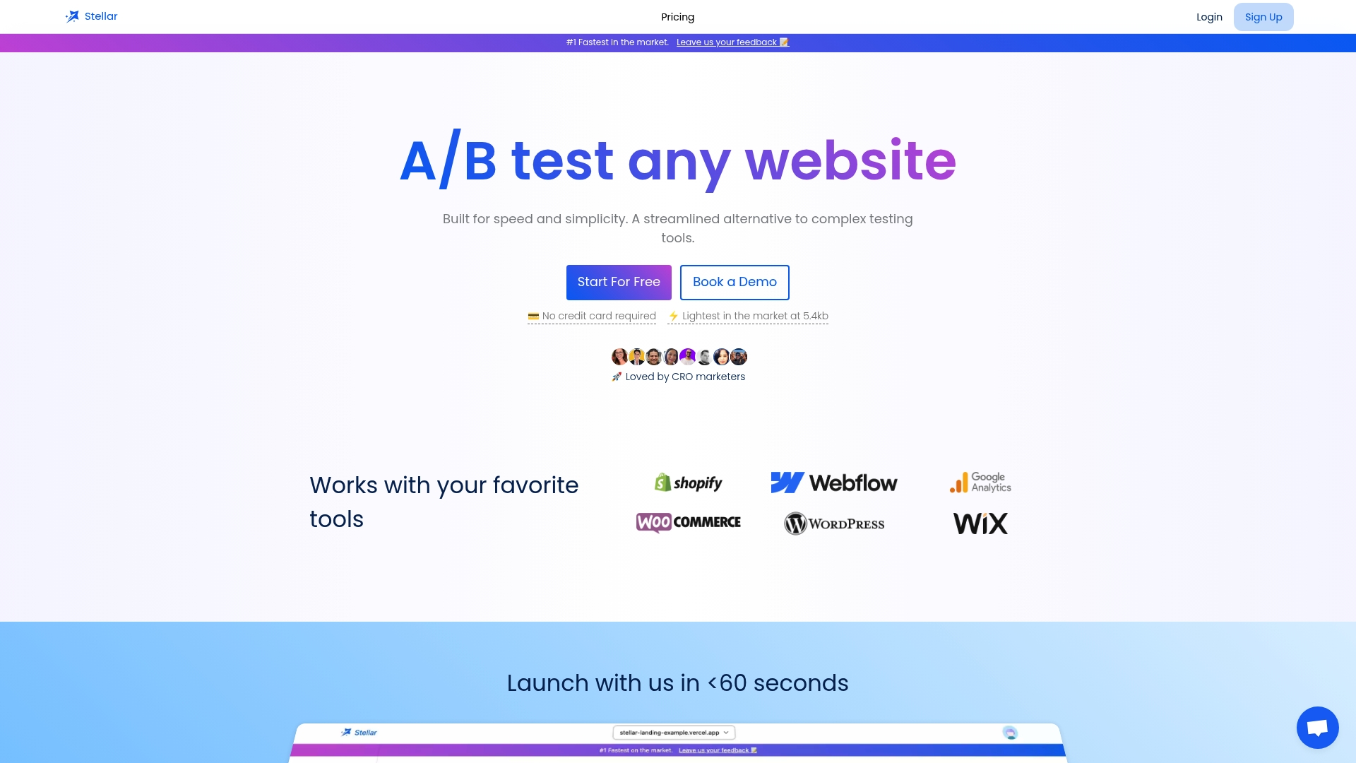
Pricing is based on monthly tracked users. The Sandbox plan is $0 per month and is meant for sites under 25,000 monthly tracked users. Paid plans are Plus at $29 per month, Pro at $99 per month and Scale at $399 per month, and Enterprise is available on request. See the plans on the Stellar homepage.
FAQ
What is a website UX audit?
It is a structured review of how visitors experience your site, covering usability, accessibility, visual design, content and performance. It draws on analytics, expert heuristic review and usability testing. The output is a prioritized list of problems and recommendations.
How long does a UX audit take?
A focused audit of one journey can take a few days. Baymard says a heuristic evaluation can be completed in a single day per flow. Usability testing and reporting add time, so a broader audit across several flows takes longer.
What should be included in a website audit?
Include analytics (conversion rate by device and source, bounce and exit pages, load time), a heuristic review, a content and information check near conversion points, an accessibility scan and, ideally, a small round of usability tests. Finish with severity ratings and an impact-versus-effort ranking.
How do I do a UX review of a website myself?
Pick one audience and one journey, pull the funnel data, then walk the journey on desktop and mobile against a set of heuristics. Note every point where a new visitor might hesitate, rate each by impact and effort, and test the top fixes.
Sources
- How to conduct a UX audit: Steps, tips, & best practices (HubSpot)
- Ecommerce UX Research & Audits: Definitive Guide (Baymard Institute)
- The Essential UX Audit Guide (Dovetail)
- What Is a Website UX Audit? A Practical Guide (Anala)
- How to Run a UX Audit: Process, Checklist and Output (Great Question)
- Ecommerce UX Audit: Make Your Website User-Friendly (Shopify)
- CRO Audit: Step-by-Step Guide (UXtweak)
- UX Audit: Heuristic Evaluation, Usability Testing and more (Space Ads)
- How to research website user experience (Yugin Dmitriy)
- How to Conduct a UX Audit: A Step-by-Step Guide (Graphic Eagle)
- UX Audit: What It Is, How to Do One & Checklist (UX Audit Pro)
- Website UX Audit: Steps, Checklist and Best Tools (UXCam)
- How to Conduct a UX Audit: Process, Tools and Template (Musemind)
- Expert Design Review: UX audit services (Nielsen Norman Group)