
Mobile-Optimized Website: What It Is and How to Build One
A mobile-optimized website is built around how people use a phone: small screens, thumbs instead of cursors, and little patience for slow pages. It loads fast, keeps navigation short, makes buttons easy to tap, and cuts the steps between a visitor and the thing they came to do. Responsive layouts are the usual starting point, but optimization goes further. This guide explains the terms, then gives you a checklist you can work through and a way to prove each change helped.
TL;DR
- Mobile-optimized means designed for phones first. Mobile-friendly means a desktop site that shrinks acceptably. Responsive is the technique most teams use to get there.
- Google indexes the mobile version of your site, so content, metadata and structured data must match across mobile and desktop.
- Aim for Core Web Vitals at the 75th percentile: LCP within 2.5 seconds, INP at or below 200 milliseconds, CLS at or below 0.1.
- Prioritize changes by business goal (sales, leads), then test each one instead of trusting opinion.
Table of Contents
- What a mobile-optimized website actually is
- Why it matters for search and revenue
- Get the foundations right for search
- Speed: the part that decides everything else
- Design for thumbs, not cursors
- How to check whether your site is optimized
- Decide what to fix first
- Perspective: test mobile changes, do not assume them
- Test your mobile changes with Stellar
- FAQ
- Sources
What a mobile-optimized website actually is
Search Engine Land describes mobile optimization as designing and developing your site to give mobile users the best possible experience on small-screen devices. The key word is experience. A page can technically fit a 390-pixel-wide screen and still be miserable: tiny links, a four-screen-tall menu, a checkout form that wants twelve fields.
The approach that separates optimized from merely compatible is starting from the phone. The 99designs team describes a mobile-optimized site as one designed for mobile use first, beginning at the smallest screen size and expanding upward, rather than a resized desktop site.

Mobile-friendly vs. responsive vs. mobile-optimized
These three terms get mixed up constantly. Here is the practical difference.
| Term | What it means | Typical weakness |
|---|---|---|
| Mobile-friendly | A desktop-oriented site that adapts well enough to read and use on a phone | Mobile tasks feel like an afterthought |
| Responsive | One codebase whose layout reflows to fit any screen | Can still be heavy and slow if desktop assets load on phones |
| Mobile-optimized | Designed phone-first, with speed, content and flows tuned for mobile behavior | Takes deliberate design and testing work |
They are not mutually exclusive. Most mobile-optimized sites are responsive underneath. Google recommends responsive web design because it is the easiest pattern to implement and maintain.
There is a real trade-off if you consider a separate mobile site. Nielsen Norman Group has noted that mobile-dedicated sites can be faster than responsive ones, but you then maintain separate codebases and risk content mismatches between versions. For most small and mid-sized businesses, one responsive build, tuned carefully, is the sensible path.
Why it matters for search and revenue
Google uses the mobile version of a page, crawled with its smartphone agent, for indexing and ranking. That means whatever is missing on your mobile version is effectively missing from Google's view of your page. If you hide a FAQ block, trim product copy or drop structured data on phones to save space, you are trimming your rankings too.
The revenue side is just as direct. Google Ads Help states that nearly half of mobile visitors abandon a page that takes longer than 3 seconds to load. Every second you shave off is traffic you already paid for staying put.
The link between mobile experience, matching content and visibility is covered well in this piece on mobile optimization and e-commerce SEO, which is worth a read if you run a store.
Get the foundations right for search
Before polishing design, make sure Google sees the same site your visitors do. Google's mobile-first indexing guidance boils down to a short list:
- Same primary content on both versions. Text, images and video that matter for ranking should appear on mobile, not just desktop.
- Same metadata. Titles and meta descriptions should match across versions.
- Same structured data. If your desktop pages carry product, review or FAQ markup, mobile pages need it too.
- Crawlable and renderable. Do not block the resources (CSS, JavaScript, images) Googlebot needs to render the mobile page.
- Visual content that works. Use supported image formats and sensible alt text, and avoid lazy-loading patterns that hide content until a user interaction Google will not perform.
All of this is spelled out in Google's mobile-first indexing best practices. A quick audit is easy: open a key page on desktop and on your phone, and compare headings, copy, internal links and markup side by side. Any gap is a fix.
Speed: the part that decides everything else
A gorgeous mobile layout does not matter if it arrives late. Google's three Core Web Vitals give you concrete targets. The recommended thresholds, measured at the 75th percentile of page loads, are:
| Metric | What it measures | Good |
|---|---|---|
| LCP (Largest Contentful Paint) | How fast the main content appears | 2.5 seconds or less |
| INP (Interaction to Next Paint) | How quickly the page responds to taps and clicks | 200 milliseconds or less |
| CLS (Cumulative Layout Shift) | How much the layout jumps around | 0.1 or less |
The thresholds are the same on mobile and desktop, but hitting them on a phone on a mid-range connection is harder, which is why mobile is where most sites fail. Google highly recommends good Core Web Vitals both for Search and for user experience in general.
Where mobile speed usually leaks
- Oversized images. Serve images sized for the screen, in modern formats, and lazy-load those below the fold. Do not lazy-load the hero image that determines LCP.
- Render-blocking CSS and JavaScript. Defer what is not needed for the first view. Digital.gov's mobile guide covers optimizing JavaScript, CSS and images, plus caching.
- Third-party scripts. Chat widgets, tag managers, heatmaps and testing tools all add weight. Audit them every quarter and remove what nobody uses.
- Layout shift. Reserve space for images, ads and embeds so content does not jump as it loads.
- Pop-ups. Full-screen overlays on a phone are hard to dismiss and hurt both usability and INP. Use small, delayed, easy-to-close alternatives.
If you want a deeper walk-through, our guides on website speed optimization and website performance metrics go through measurement and fixes in detail, and why page speed matters for marketers makes the business case.
Design for thumbs, not cursors
Navigation
Google's own example of mobile optimization is a simplified menu, so visitors find what they want without hunting around or zooming in. Think with Google's mobile design research adds two useful rules: keep menus short, because mobile users will not scroll a long list, and make the logo tap back to the homepage, which is what people expect.
In practice:
- Limit the top-level menu to the five or six destinations that drive business.
- Put search in reach if you have a catalog.
- Keep the primary action (book, buy, start trial) visible without opening the menu.
Tap targets and spacing
Fingers are blunt. web.dev suggests a minimum touch target of around 48 device-independent pixels, roughly 9 mm, and notes that padding can enlarge a smaller icon to reach it. For accessibility compliance, WCAG 2.2 sets a floor of 24 by 24 CSS pixels for pointer targets, with exceptions for adequate spacing and inline links. Treat 24 as the legal-style minimum and 44 to 48 as the design goal.

Also keep controls usable with other inputs. WCAG's failure technique F98 warns against limiting interactions to touch only: a keyboard or mouse should still work on a device that has a touchscreen.
Readable type
Use body text large enough to read without pinching, keep line lengths short, and leave generous space between links so a thumb does not hit the wrong one. Set the viewport meta tag properly, or none of your responsive rules will behave as intended.
Forms and checkout
This is where mobile sales are won or lost. Google Ads Help advises you to put "Buy now" buttons front and center, simplify navigation, minimize data entry and reduce the number of steps to complete a transaction. For lead generation, it recommends minimal form fields and validation that helps people correct errors.
A short checklist for forms:
- Ask only for what you need to follow up. Cut "company size" if sales never uses it.
- Use the right keyboard per field (numeric for phone, email layout for email).
- Enable autofill and, where it fits, digital wallets at checkout.
- Show errors next to the field, in plain words, as the user types.
- Make the submit button full width and keep it above the on-screen keyboard.
For landing pages specifically, our guides on optimizing mobile landing pages and designing landing pages that convert leads go further.
How to check whether your site is optimized
Run these checks in order. Each takes minutes.
- Real devices. Load your top five pages on an actual phone, on cellular, not office Wi-Fi. Try to complete your main goal one-handed.
- Lighthouse and field data. Run Lighthouse in Chrome DevTools for lab diagnostics, then check field data for Core Web Vitals in Search Console, since field numbers are what Google evaluates.
- Parity audit. Compare mobile and desktop versions of content, metadata and structured data, as described above.
- Task test. Ask three people who do not know your site to find a product, add it to the cart and start checkout on their phones. Watch where they hesitate.
- Analytics split. Compare mobile conversion rate and bounce rate against desktop for the same pages. A big gap points to where to look first.
Decide what to fix first
You will find more problems than you can fix this month. Google's guidance is to judge mobile optimization by whether the design supports your business goal, whether that is sales, leads or store visits. So rank fixes by that goal:
- Anything that breaks the path to conversion (broken forms, hidden buttons, checkout errors).
- Anything that makes the key landing pages slow (LCP above 2.5 seconds).
- Navigation and content clutter on high-traffic pages.
- Polish on low-traffic pages.
For a structured way to schedule this work, see our 30/90/180-day plan for optimizing a website.
Perspective: test mobile changes, do not assume them
We see the same pattern with small teams: they redesign for mobile based on a best-practice list, ship it, and never learn which change helped. Some changes backfire. A sticky bar can lift taps on one page and cover the checkout button on another. A shorter form can bring more leads that are worth less.
Our view is that mobile optimization is an experiment program, not a one-time project. Pick one page, form a hypothesis ("a single-column form with fewer fields will raise completed submissions on phones"), split traffic, and let the data decide. That only works if the testing tool itself does not slow the page you are trying to speed up. It is why we built Stellar around a script of just 5.4KB, so testing does not undo your Core Web Vitals work. If you want to understand that trade-off, read our piece on Core Web Vitals and A/B testing without the bloat, and for ideas on what to test, our mobile conversion optimization strategies.
— Juan
Test your mobile changes with Stellar
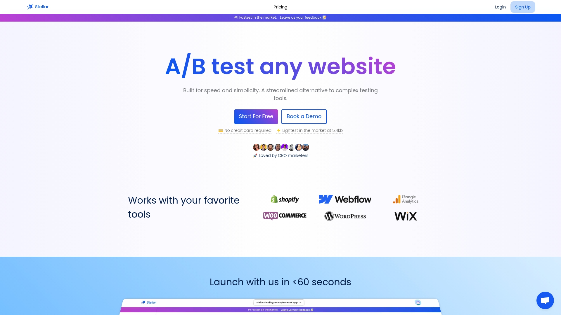
Once you have a short list of mobile fixes, Stellar lets you test them without waiting on a developer. The no-code visual editor handles web and mobile layouts, goal tracking shows whether a variant drove the sign-ups or sales you care about, and real-time analytics show results as they arrive. It connects directly with WordPress, Shopify, Webflow, Wix, Squarespace, Framer and Bubble.
Pricing follows monthly tracked users. The Sandbox plan is $0 per month, Plus is $29 per month, Pro is $99 per month and Scale is $399 per month, with Enterprise available on request. You can compare the tiers and start on Stellar's plans page. If you want to add social proof on mobile pages, the free FOMO popup generator is a quick thing to try, though keep any overlay small on phones.
FAQ
What is a mobile-optimized website?
It is a site designed and built so the experience is best on a phone: fast loading, short navigation, large tap targets, simple forms and content that matches the desktop version. It is usually built phone-first, then expanded for larger screens.
Is responsive design the same as mobile optimization?
No. Responsive design is a technique that reflows one site to fit any screen size. Mobile optimization is the broader goal of making the phone experience fast and easy. A responsive site can still be slow or awkward on mobile if its assets and flows were not tuned for it.
What is an example of mobile optimization?
Simplifying the menu is the classic one: fewer items, a tappable logo to return home, and the main action always visible. Other examples are compressing images, trimming form fields and keeping checkout to as few steps as possible.
How do I optimize a desktop website for mobile?
Start by checking that your mobile pages carry the same content, metadata and structured data as desktop. Then fix speed against Core Web Vitals, shorten navigation, enlarge tap targets and cut form fields. Finally, test each change on your highest-traffic pages so you know it improved conversions.
Sources
- Mobile Optimization: What it is, why it's important (Search Engine Land)
- Mobile-friendly vs. responsive vs. mobile-optimized (99designs)
- Mobile-first Indexing Best Practices (Google Search Central)
- Mobile Websites: Mobile-Dedicated, Responsive, Adaptive, or Separate (Nielsen Norman Group)
- Optimize your website for mobile (Google Ads Help)
- How the Core Web Vitals metrics thresholds were defined (web.dev)
- Understanding Core Web Vitals and Google search results (Google Search Central)
- Principles of Mobile Site Design (Think with Google)
- Accessible tap targets (web.dev)
- Web Content Accessibility Guidelines (WCAG) 2.2 (W3C)
- F98: Failure due to interactions being limited to touch (W3C)
- Impact of Mobile Optimization: Boosting E-commerce SEO